The Best Bohemian Paint Colors
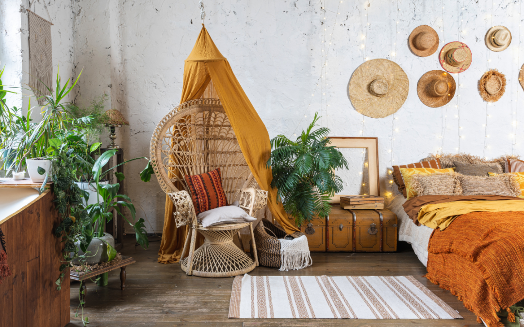
If you look on Pinterest, you’re almost guaranteed to see some bohemian interior design inspiration. The bohemian decor style has been massively popular over the last decade and it doesn’t seem to be slowing down. With its relaxed vibe, layered textures, and cozy feel it’s not a surprise that people want to bring this look into their homes but what about bohemian paint colors? There are a wide variety of paint options that can read as bohemian so we’ve pulled together some of our favorite Sherwin Williams bohemian paint colors to make things easy for you!
Neutral Bohemian Paint Colors
On one end of the boho spectrum you’ll find a lot of neutrals. Neutrals are great because they’re easily adapted to a variety of styles and they don’t overwhelm a space. When it comes to using neutral paint in a space, you’re really relying on your furniture and accessories to tie in the bohemian look. This means you can go big with the bohemian style or sprinkle it in as you see fit. Some of our favorite neutral bohemian paint colors are Bungalow Beige SW 7511, Only Natural SW 7596, Alabaster SW 7008, and Moderate White SW 6140. If you love the all white look, check out this article about the best white paint colors.
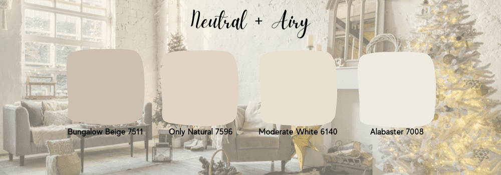
From left to right; Bungalow Beige SW 7511, Only Natural 7596, Moderate White SW 6140, Alabaster SW 7008
Bungalow Beige SW 7511
Bungalow Beige is a beautiful cool toned beige. The cooler tone really helps keep the color looking modern and fresh when compared to more traditional beige paints.
Only Natural SW 7596
We absolutely love Only Natural! It’s a little bit more of a traditional beige or warm white with a slightly pink undertone. Only Natural will help create a warm, youthful, and inviting bohemian space.
Alabaster SW 7008
If you’re looking for something that’s a bit more of a true white then look no further than Alabaster. This is a warm white with just a little bit of yellow in it. It’s perfect for a boho chic home with an open floor plan or if you want an incredibly versatile paint color that can be styled any way you like.
Moderate White SW 6140
Moderate White really toes the line between being warm and cool. It’s a nice bright white with a bit of warmth to it but it still feels fairly modern when applied to walls.
Bold Bohemian Paint Colors
Going with a neutral paint color might feel a little too safe for you so why not make more of a statement with your space? If you don’t have an open floor plan it’s so fun to play around with colors that have a bit more depth and interest but if you do have an open floor plan, consider using these colors as an accent wall. If you’re feeling brave check out Ruskin Room Green SW 0042, Studio Blue Green SW 0047, Roycroft Rose SW 0034, Decorous Amber SW 0007, and Viva Gold SW 6367.
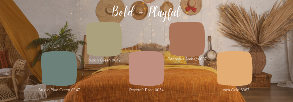
From left to right; Studio Blue Green SW 0047, Ruskin Green SW 0042, Roycroft Rose SW 0034, Decorous Amber 0007, Viva Gold SW 6367
Ruskin Green SW 0042
Ruskin Green is straight out of the 70’s as a nod to the very trendy avocado color that was used floor to ceiling in many kitchens across America. We love this green paired with warm woods, mid century silhouettes, and layered neutral textures for the perfect boho vibe.
Studio Blue Green SW 0047
This is a Sherwin Williams classic and we love a good blue green. What makes Studio Blue Green so usable is the slightly gray undertone. This helps to mute the saturation of the color allowing you to use this in any space without it being too overwhelming or “childish”.
Roycroft Rose SW 0034
Roycroft Rose is soft, earthy, and just a little bit romantic. Sounds like a bohemian color to us! This is the most neutral of all of our bold bohemian paint colors so if you’re nervous about going too bright or bold this might be a perfect fit for you.
Decorous Amber SW 0007
For a slightly deeper paint color that has even more of an earthy tone we love Decorous Amber. This terracotta orangey brown is rich and cozy, sure to create a welcoming space.
Viva Gold SW 6367
Yellow is a pretty polarizing color. You either love it or absolutely hate it but we don’t have any problems with this golden hue. Viva Gold is a funky, dark mustard color that wasn’t made for the faint of heart. Rather than painting all of your walls with this statement color, we recommend trying an accent wall or using it in a small space like a bathroom.
Dark Bohemian Paint Colors
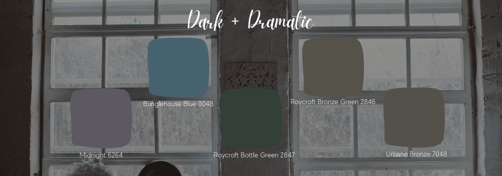
From left to right; Midnight SW 6264, Bunglehouse Blue SW 0048, Roycroft Bottle Green SW 2847, Roycroft Bronze Green SW 2845, Urbane Bronze SW 7048
To get that bohemian look you do not have to keep things light or colorful. The bohemian style pairs beautifully with deep, dark paint colors as well and we’ve picked out some of our favorites. These colors are much darker so be cautious with these if you have an open floor plan or your home lacks good natural or artificial light as these might be too heavy. Some of our favorites are Bunglehouse Blue SW 0048, Roycroft Bottle Green SW 2847, Roycroft Bronze Green SW 2846, Midnight SW 6264, and Urbane Bronze SW 7048.
Bunglehouse Blue SW 0048
Blue is one of the most popular colors in the world and this blue is just so cool. It’s a deep blue with a gray undertone which again, helps mute the saturation. Muting the saturation helps the color feel more elevated and sophisticated which can help darker paint colors feel less intense.
Roycroft Bottle Green SW 2847 and Roycroft Bronze Green SW 2846
We couldn’t decide between these two classic greens but they both bring something different to the table. Bottle Green has more blue in it and we love this for a dining room or office. Bronze Green is a muted, dark forest green so it’s great if you don’t like a blue undertone.
Midnight SW 6264
Just as the name suggests, this is a dark, inky color but it’s purple tone makes it much more fun than your standard black. If Midnight is a bit too dark, consider something slightly warmer like Expressive Plum SW 6271 to create an intimate and romantic space.
Urbane Bronze SW 7048
If you have wall paneling then please consider Urbane Bronze. This is one of Sherwin Williams most popular blacks but thanks to it’s slightly gray undertone it actually ends up looking a bit matte. It was even just announced as the 2021 Color of the Year! Urbane Bronze is the perfect bohemian paint color for creating a cool and dramatic room. We absolutely love this for a living room to create a bold and interesting statement.
Boho Inspired Paint Color
As you can see, there is a perfect bohemian paint color for everyone regardless of your personal style. From versatile neutrals to bold pops of color and even dramatic darks there is a boho color for you. Remember, your furnishings and decor will really bring the bohemian style to life so focus on warm woods, varied textures, layers, and decor that captures the bohemian spirit. For more bohemian room inspiration head on over to our Pinterest page! If you’re ready to try some of these boho colors out then make sure you are testing your paint the right way.