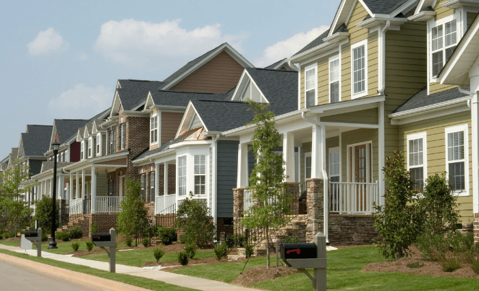
Which Paint Colors Should You Avoid (And Alternatives for Them)
Not all paint colors are created equal and although choosing a color is extremely personal, here are a few of the colors we tend to steer clients away from. Small disclaimer here, if you love a color then you should absolutely use it no matter what other people think or say. This is just a fun list of colors that we don’t typically recommend and our reasoning as to why they don’t always work.

Left; High Reflective white. Top right; Pure White, Bottom left to right; Snowbound and Alabaster
High Reflective White
Right out the gates with a controversial pick. High Reflective White SW 7757 is a very common color for clients to turn to. This tends to read as the “truest” white to the naked eye which is probably why so many clients like this for cabinets, trim, and ceilings but it’s not our favorite. First, High Reflective White is only available on interior products which means you can’t use it on your exterior. This is because High Reflective White doesn’t have a lot of pigment in it which can mean you might run into challenges getting good coverage with this color. It’s also a very stark white that doesn’t have any dimension so we would never recommend it for walls. Instead of High Reflective White try a white like Pure White SW 7005, Snowbound SW 7004, or Alabaster SW 7008. These colors offer greater coverage and a more interesting look.
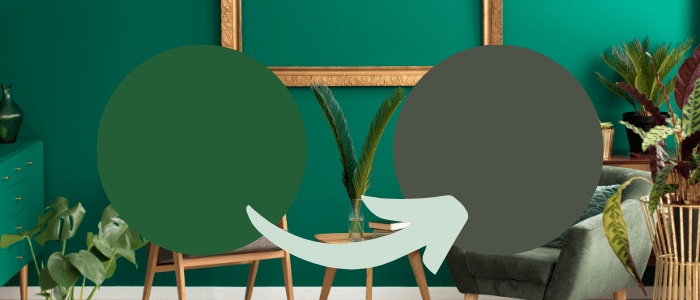
Left to right; Derbyshire and Forestwood
Derbyshire
Here in Colorado, green is a traditional trim color on mountain homes so you do see it quite a bit but green can be a difficult color to get right. Most greens, like Derbyshire SW 6741, are too vibrant to be used on the exterior of the home. In fact, we try to steer clients away from choosing paints that are supersaturated and bold because they can come across as too young and playful. If you’re going for the look of Derbyshire then try something with a little more gray in it like Forestwood SW 7730. This will help tone down the brightness and ground the color.

Left; Mineral Gray. Top right; Naval, Bottom right; Gibraltar
Mineral Gray
Navy blues and deep grays have been really popular and a lot of clients like Mineral Gray because it appears to be somewhere between a navy and a gray. Look a little closer though and you’ll see that Mineral Gray SW 2740 has a sneaky little secret; it actually appears purple. In full sun, this really interesting and cool color can take a wild turn and we’ve seen it happen one too many times. To avoid being “that neighbor” we recommend you skip Mineral Gray in lieu of something like Naval SW 6244 or Gibraltar SW 6257.

Left to right; Jonquil and Peace Yellow
Jonquil
It seems that everyone these days wants to paint their home yellow. Cheery yellows like Jonquil SW 6674 can be really enticing if you’re looking to brighten things up with a happy color but they’re not our favorite. Yellow is a pretty unnatural color here in Colorado and while most neighborhoods require earth tones, this statement color can really clash and feel out of place. Yellows are also very susceptible to fading and most options are not available in higher-end exterior paint products. If you must go yellow we recommend choosing a toned-down color like Peace Yellow SW 2857. It doesn’t look as vibrant as Jonquil but trust us, your neighbors will thank you when your home isn’t brighter than the sun.
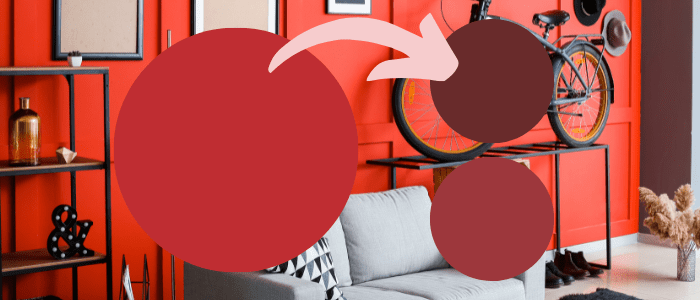
Left; Real Red, Top right; Sundried Tomato, Bottom right; Poinsetta
Real Red
Red is one of the most popular colors for front doors but is there such a thing as a red that’s too red? Yes. Just like with some of the other colors we’ve mentioned, clients tend to go for hyper-saturated colors that don’t really work on an exterior. Red is a very difficult color for our eyes to process so a super bright, vibrant red can draw a lot of attention but it can also make things feel imbalanced. To do a red door well, we recommend leaving colors like Real Red SW 6868 at the paint store and picking up something like Sundried Tomato SW 7585 or Poinsetta SW 6594 for a fun pop that isn’t too overpowering.
The Worst Paint Colors from Sherwin Williams
These are just our opinions so again, if you love one of these colors then please use it! Color trends come and go so it’s really just important to choose paint colors that suit your taste. In general, we do recommend double-checking to make sure you’ve chosen colors that have at least some gray in them because this can help you avoid those overly saturated color options. You can also make brighter colors more usable by incorporating them into your space as an accent color. As always, please be sure to get samples before committing to a color so you can see the color in your space.