Top 10 Earth Tone Paint Colors
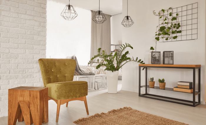
If you’ve been paying attention, you may have noticed a big shift in interior decorating trends. Only a couple of years ago, homeowners were constantly reaching for cooler blue and gray tones to get a sleek, modern, and airy look. Now that trend is almost completely out with the reintroduction of warmer, earth tones. These colors actually pull inspiration from the 1970s and it’s all about bringing the color of nature into your home. We particularly love this transition within the industry because these warmer colors will make your home feel more inviting, cozy, and grounded. If you’re hoping to achieve this look then keep reading for our top 10 earth tones from Sherwin Williams.
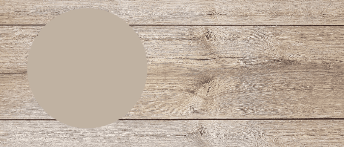
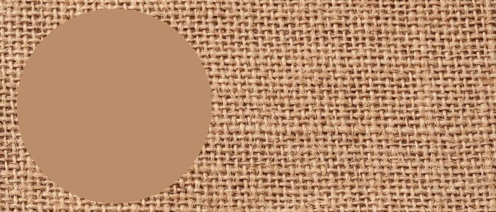
Balanced Beige from Sherwin Williams
Balanced Beige SW 7037
Beige is back and you heard it here first. Beige has replaced gray as the go-to neutral and we’re all here for it. Beige is a combination of yellow, pink, and orange tones so there can be quite a bit of variation between different beige options. To keep your beige looking updated and fresh, we recommend something like Balanced Beige because it has less yellow and more of a slightly cool undertone. This helps keep it from looking dated or too warm.
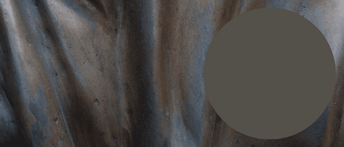
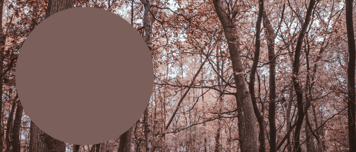
Urbane Bronze by Sherwin Williams
Urbane Bronze SW 7048
This was Sherwin Williams’s color of the year and it’s easy to see why. Urbane Bronze is a deep gray-brown that is dramatic and very grounding. Thanks to the heavy gray undertone, this color can add a depth and richness to a room that’s hard to achieve with other colors. In most settings, it can often look almost matte in its finish which creates a luxurious look. If you’re brave enough to go for something bold, we are absolutely obsessed with this color!
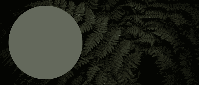
Rosemary by Sherwin Williams
Rosemary SW 6187
We’ve talked about Rosemary before on our social media but we couldn’t do a top 10 earth tones list and not include it. Rosemary from Sherwin Williams is a beautiful green perfect for exteriors or interiors. It has the perfect amount of gray in it to help balance the green and make the color feel more natural and earthy. Green is associated with nature, plants, and calming energy so this is a great way to bring the outside into your home. If you have a hard time keeping plants alive, consider painting your walls green to add that element to your space.
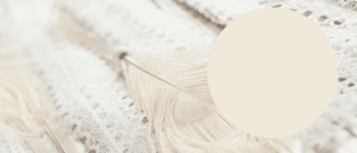
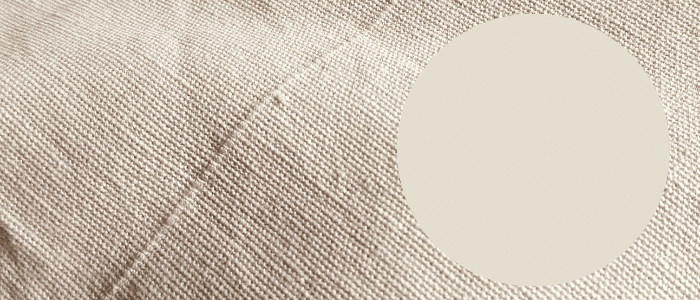
Creamy by Sherwin Williams
Creamy SW 7012
If you prefer a lighter color option or if you like to keep your walls neutral, Creamy might be just the right solution. This beautiful warm white looks like melted vanilla ice cream so it’s sure to add a nice energy to your walls. This is also a great alternative to beiges if you are worried about the finished product. Creamy also pairs very well with other earth tones and you can amp it up by adding warm woods and textured items.
Oak Creek by Sherwin Williams
Oak Creek SW 7718
This next color takes beige up a few notches and it’s not for the faint of heart. Oak Creek is a rusty terra cotta color that has a heavy red undertone. Clay-inspired colors have been increasingly popular but if this feels like a bit too much for a wall color then you still have options. Make this color more usable by adding it to a small bathroom, making it a featured accent wall, or play it extra safe and find accessories in this color that can be switched out as needed.
Latte by Sherwin Williams
Latte SW 6108
Latte is a cooler option that doesn’t have as intense of a warm undertone. Proof that there are earth tones for everyone. We love this option because you can mix warm and cool colored decor and furniture items with it without many challenges. We particularly love this color paired with creams, whites, warm browns, gray blues, and organics like plants.
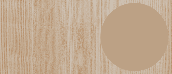
Accessible Beige by Sherwin Williams
Accessible Beige SW 7036
If Creamy and Latte had a paint baby, Accessible Beige would be it. This is an awesome color option if you want to join the earth tone trend but you just prefer cooler colors. Accessible Beige is a very neutral beige that has a great balance of tones which makes for a very dynamic color. This paint color has been featured on Sherwin Williams’ Top 50 Most Popular Colors for years so it’s a tried and true classic.

Granite Peak by Sherwin Williams
Granite Peak SW 6250
Can blue be an earth tone? We definitely think so! Granite Peak is a strong, beautiful color that draws inspiration from the gray-blue color of a mountain peak. This color is particularly beautiful on an exterior, especially when paired with a crisp white trim but don’t be afraid to use this on your interior as well. This makes for a great bathroom or kitchen option and creates a calming effect.
Bateau Brown by Sherwin Williams
Bateau Brown SW 6033
Bateau Brown is a really unique brown option thanks to its red and gray undertone. It has a slightly purple element to it without being overpowering so it can really be used anywhere. This also makes for a really interesting choice as an exterior color in lieu of a red or strictly brown option so your home would surely stand out (but in a good way). Pair this with white, black, and gray for a sophisticated look that can make use of pieces you already have.
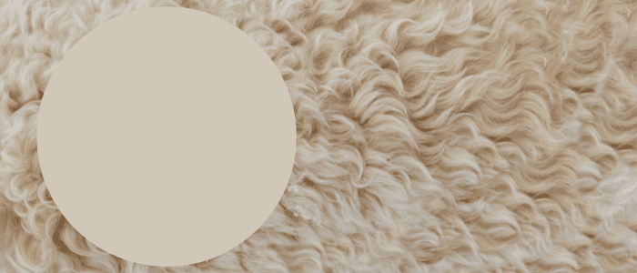
Natural Choice by Sherwin Williams
Natural Choice SW 7011
Natural Choice was a natural choice for our top 10 earth tone colors so it’s rounding out our list today. Natural Choice is a creamy, slightly bone-colored white which makes it very versatile. A color like this is great for creating a neutral backdrop that allows other features or furniture to shine. You can also pair this color with another bolder color to create a fun statement wall. This also works very well in an open floor plan to create a cohesive and harmonious flow throughout the house.
Best Earth Tone Paint Colors
We’re eager to see this trend continue to grow and find new ways to help you incorporate these colors into your color palette. Remember, you can tone down bolder colors by adding layered textures and neutral colors like tan, brown, cream, white, and black. Now is the time to embrace natural wood, greenery, and organic shapes and fibers. For more inspiration on color schemes and palettes please be sure to follow us over on Pinterest!