
How to Choose Paint Colors When You’re Color Blind
If you’re color blind, the task of choosing paint colors can be daunting. For a lot of people, finding the right paint color is challenging enough so the added obstacle of seeing color in an abnormal way can make the process even harder. Being color blind doesn’t mean you can’t be part of the color selection process though. The right approach and leaning on a professional or the input of others can put you in a paint color that you can truly enjoy.
What Kind of Color Blindness Do I Have?
One of the first things you’ll want to do is to determine what kind of color blindness you have. Color blindness is when someone cannot distinguish between certain colors. The most common colors this happens with are reds and greens, and sometimes blues and yellows. Color blindness can happen when one or more of the color cone cells within your eye is absent, not working properly, or identify a different color than normal. Everyone sees color differently but true color blindness can make accurate color identification nearly impossible.
To confirm what kind of color blindness you have, we recommend taking an online test like this one or this one. This should help you get a better understanding of what kind of color blindness you have and the severity of it. Keep in mind, some people experience total color blindness where they cannot perceive color at all but partial color blindness is much more common.
Choosing Paint Colors for Color Blindness
Once you’ve completed your test you can begin exploring different paint color options. When we work with a client who is color blind, our goal is to make sure we are choosing colors that they can see clearly. When choosing paint colors, make sure you are not looking at color schemes that you’re unable to distinguish. The focus should be on using other colors or developing palettes that make use of the colors you can identify. Once you’ve identified colors that are visible and that you enjoy, stick with a palette that makes use of the lighter tints and darker shades of that same color. This will help to create a harmonious scheme that will look great and that you can enjoy.
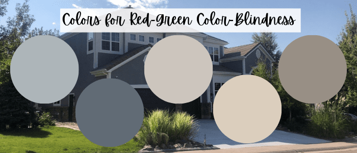
From left to right; Jubilee, Granite Peak, Alpaca, Rivers Edge, and Elephants Ear
Best Paint Colors for Green-Red Color Blindness
If you are faced with the kind of color blindness that makes it difficult to distinguish red from green then we would recommend you steer clear of those two colors. Instead, focus on blues, grays, taupes, whites, purples, yellows, and beiges. Again, one of the best tips is to choose one color and then select contrasting tints and shades of that color to create variety and interest without needing to differentiate between two colors. For example; if you like blues, you could go with a lighter gray-blue like Jubilee SW 6248 and a navy blue like Granite Peak SW 6250. This keeps things from looking flat but doesn’t bring in colors that aren’t easy to identify.
Some other great color combinations for someone with green-red color blindness are Cool Beige SW 9086 and Llama Wool SW 9089, Alpaca SW 7022 and Elephants Ear SW 9168, Rivers Edge SW 7517 and Threshold Taupe SW 7501, Sensitive Tint SW 6267, and Autumn Orchid SW 9157. Just because you’re color blind, it doesn’t mean you can’t enjoy a space with color but what if you’ve got blue-yellow color blindness?
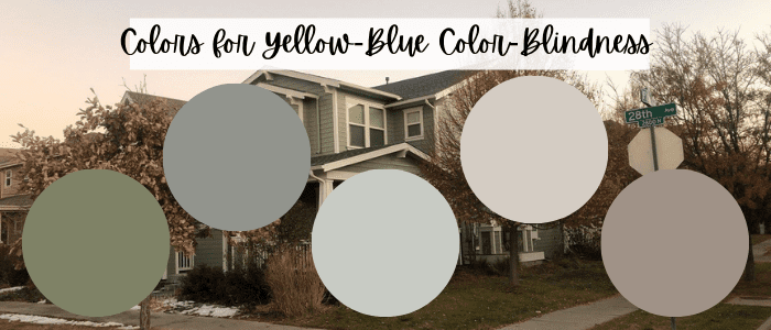
From left to right; Artichoke, Illusive Green, Silver Strand, Popular Gray, and Chatura Gray
Best Paint Colors for Yellow-Blue Color Blindness
Similar to green-red color blindness, you’ll want to use the same approach if you have blue-yellow color blindness. In order to make sure that you can enjoy your space and still embrace color, we would recommend avoiding blues and yellows in your color scheme. That means you might consider looking for true greens, reds, warm purples, and taupes. These schemes may have a bit more warmth to them but you’ll still want to avoid oranges and yellows. To follow the same strategy, consider choosing a single color and then using a lighter tint and a darker shade of that color to create your scheme. For example, if you chose green, you can use a color like Softened Green SW 6177 and pair it with a darker shade like Artichoke SW 6179.
It’s important that you look at different combinations because the severity of your color blindness may vary from someone else’s. Try out Silver Strand SW 7057 and Illusive Green SW 9164, Popular Gray SW 6071 and Chatura Gray SW 9169, and Doeskin SW 6044 and Swing Brown SW 6046.
Closing Thoughts on Color-Blind Paint Color Selection
Ultimately, choosing the right paint color when you’re color blind isn’t that different from the typical color selection process. The most important thing is to make sure you are very aware of what kind of colors you might want to steer clear of and respect that. It’s also a good idea to ask for help, either from a professional color consultant or from a trusted friend or family member. Your opinion and the feeling you have when viewing the colors is important but having someone there to bounce ideas off of and validate some of your choices can be extremely helpful.
At the end of the day, being color blind does not have to mean that you have to live without colorful spaces or that your opinion on colors doesn’t matter. Understanding what challenges you face with colors and utilizing the tools and tips available to narrow down your color options means you can have an amazing color experience with an outstanding finished product.