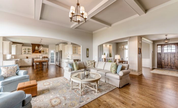
Best Neutral Colors for Open Floor Plan Homes
Open floor plans have been all the rage for years now, just turn on HGTV and you’ll see what we’re talking about. We love an open floor plan but we’ve seen clients struggle to find a paint color that can work throughout multiple spaces. Since open floor plans don’t often have clear cut-off points it’s important to choose a paint color that can flow throughout the space and unify those rooms without clashing. If you’re in a home with an open floor plan and you’ve struggled to find the right paint color then keep reading for some of our top picks for foolproof paint colors.
Top 5 Most Popular Paint Colors for Open Floor Plans
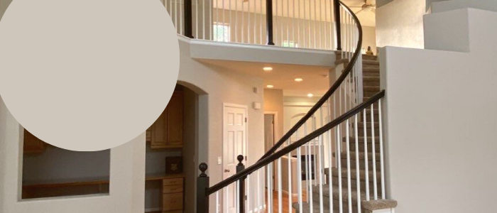
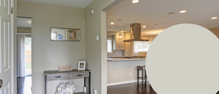
Worldly Gray SW 7043
Worldly Gray SW 7043
Anyone who knows me knows that Worldly Gray from Sherwin Williams is one of my favorite interior colors. Worldly Gray is great because it’s a very warm gray which makes it dynamic. A dynamic color is wonderful for an open floor plan because it can work with both warm and cool features. Worldly Gray can also feel slightly different under different lighting conditions which can help make each room still feel unique. Since this is a neutral you also have the added benefit of being able to use different accent colors, furniture, and decor items to create designated spaces.
Worldly Gray helps bring a warmth to your space without feeling aged. It’s a modern take on a traditional beige and it avoids the cold, sterile look some grays have. For these reasons we absolutely love this color for an open floor plan.
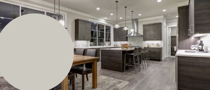
Repose Gray SW 7015
Repose Gray SW 7015
If you do prefer a more traditional gray then we’d likely recommend something like Repose Gray from Sherwin Williams. This is a lot less warm than Worldly Gray so it will give your space a more modern and sophisticated feel. One of the most common concerns with going gray is that the walls will end up looking blue or purple. This usually leads to clients requesting a gray that has no undertone. Believe it or not, a gray without any kind of undertone in it is very difficult to find in paints. This has to do with the pigments used to create paint colors and what actually makes for a satisfying color to look at. Ultimately, a “true” gray would look very flat and one-dimensional in paint. Obviously, we don’t want that for our clients. We want colors that are rich and create depth which makes them more visually appealing to look at.
Luckily, Repose Gray has a slightly warm undertone which helps keep your space cozy and welcoming without going too far into the beige territory. This also helps ensure you won’t end up with that slightly blue cast so many clients work hard to avoid.
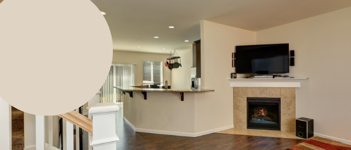
Natural Linen SW 9109
Natural Linen SW 9109
Beige is seeing a major comeback which is proof that all trends are cyclical. We love beige because it really makes a home feel mellow and homely but there is a dark side to beige. If your beige is too yellow or too pink it could end up looking aged and outdated which is definitely not the goal. The beiges that are coming back into style are a modernization of their former counterparts. This means rather than feeling dingy they feel fresh and clean. We particularly love Natural Linen SW 9109 for its creamy and earthy finish.
Natural Linen looks best with a crisp sharp white trim color like Extra White or Pure White. This creates a nice contrast that will make your open floor plan feel unified and clean. This is also a great color to play around with accent walls with a richer tone like navy.
Conservative Gray SW 6183
Conservative Gray SW 6183
Another huge trend we’ve seen pop up this year has been green. Historically, we’ve found that green can be a pretty polarizing color family. People tend to either love it or hate it so if green isn’t your vibe then you should just skip to the next color recommendation. As you can see, we’ve stuck with neutrals because Conservative Gray is a very lightly saturated green with a lot of gray in it to help tone it down. This helps your space feel earthy and grounded but contemporary at the same time.
This color is great for an open floor plan where you have a lot of cooler features in your home and it’s a fun take on a traditional gray. You can also pair it with warm woods and oranges for a modern take on a retro color scheme.
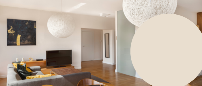
Moderate White SW 6140
Moderate White SW 6140
2017-2019 we saw a lot of all-white open floor plans. There has been a pretty large departure from this interior decorating style because it can be difficult to maintain as well as difficult to get right. A lot of white paint options are just too bright and intense which can make it difficult for the eye to process. To combat that problem, we prefer a white that has a bit more pigment in it. Here we’ve recommended Moderate White but you could also choose a white with more of a yellow undertone for a creamier finish.
What we really enjoy about Moderate White is the warm base which makes the space feel more inviting. It will also create a nice contrast between the trim and the walls which can help create variety and interest. Moderate White works really well in darker spaces to help lighten things up and it creates a beautiful canvas to create feature walls or focal points.
Popular Open Floor Plan Wall Colors
As you can see, lighter neutrals will typically be your best bet when it comes to open floor plans. Open floor plans are all about creating a large communal space so paint colors that are lighter will make the space feel more expansive and airy. Neutrals are generally preferred over more vibrant or saturated colors because it allows you to change furniture and decor items out as your tastes change. Accessories and decor items are fantastic for creating designated areas and giving a room personality without breaking the bank.