Colors Inspired by the 1970s
Looking for some groovy paint colors that will transport your home back to the ’70s? We have got you covered. The 70s are making a big comeback in everything from fashion to home decor. We’re seeing a huge surge in vintage-inspired home styling and these ’70s-inspired paint colors from Sherwin Williams are sure to hit the mark. These colors aren’t an exact replica of colors used in the ’70s but rather, a modern take on classically cool vintage color schemes.
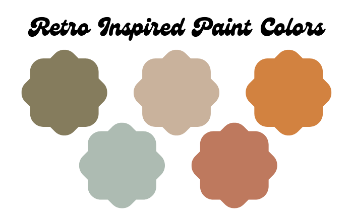
Top left to right; Avocado, Practical Beige, Amber Wave. Bottom left to right; Quietude, Caribbean Coral.
Avocado SW 2861
When you think of the 70s we’re sure this shade of green comes to mind. Avocado kitchens were in every home and this is a great way to replicate that same vibe. Avocado SW 2864 from Sherwin Williams is less saturated than the true vintage hue and that’s great because it makes it a little more modern and usable. You can absolutely use this color on your walls or, if you’re worried about overwhelming your space, use this on your cabinets for a modern take on a groovy color.
Practical Beige SW 6100
Beige was often used as a popular neutral during the 1970s and we’re seeing a lot of people turn back to this classic color. What we love about Practical Beige SW 6100 is that it’s got a nice gray undertone to it. Adding gray to a color helps to reduce saturation, cool it down, and makes the color feel more grounded. The added gray in Practical Beige helps tone down the pink undertones and feels more modern and dynamic. This really helps beige to avoid looking dated and keeps things fresh and interesting.
Amber Wave SW 6657
Maybe you just want a little punch of color and if so, look no further than Amber Wave SW 6657. This slightly rusty orange is funky and evokes plenty of that ’70s nostalgia. When it comes to using bolder colors in your home we believe more is more. What we mean is, don’t play it “safe” with bright colors – if you’re going to go for it go for it. But, if this color is a little too overwhelming or if it doesn’t make sense paired with your furniture or fixed features then consider using this color as an accent. Amber Wave would make a stunning front door color, especially when paired with a gray paint on the exterior.
Quietude SW 6212
We all already know that blue is one of the most popular colors in the world. Quietude SW 6212 from Sherwin Williams is a beautiful blue with a slightly green undertone which makes it perfect for a variety of spaces. Many of the most popular colors in the 70s were very warm and earth-toned so this color is a great way to shake that up while complementing any warmer colors you might be using. Quietude is incredibly versatile and is great for bedrooms, bathrooms, doors, cabinets, and more.
Caribbean Coral SW 2854
Rounding out our list is Caribbean Coral SW 2854. This is a beautiful rusty terracotta that is great as an allover color or as an accent. As we mentioned, the 70’s really focused on earthy tones that felt very grounded so this is a great option that brings a lot of character to a space. It also pairs well with a lot of the colors we’ve mentioned above so it can make a great addition to an overall color scheme.
Test Your Paint Colors Before You Paint
We love providing you with different ideas and inspirations surrounding your color selection but please remember to always test your colors before you begin painting. There are many factors that will impact how a paint color looks and feels within your home including furniture, lighting, the direction of windows, fixed features, and more. Testing your paint colors is a critical step in a positive color selection process so we urge you to head to your local paint store to pick up some samples or shop online for samples to be shipped directly to your home.