How to Avoid Ugly Paint Colors
When I’m out at a color consultation and I realize that the client I am working with is drawn to colors that aren’t traditionally considered to be “good” what do I do? Besides a little internal panic, there are a few things I try to do in this situation. As a color consultant it’s my job to help guide homeowners through the color selection process and help them find paint colors that I feel will work for their home and that they feel excited about. It doesn’t happen too often but sometimes this can be easier said than done when a client has their heart set on something. Here are some things you can do to avoid choosing ugly paint colors.
Be Realistic
A lot of the homeowners I work with will have done some research ahead of time. This often means walking around their neighborhood or browsing Pinterest for inspiration. When a client has photos of homes they like, I like to equate this to when you go to the hairdresser with a photo. In reality you don’t know if that photo has been edited, how long it took that person to get to that hair color, or if the same color will suit your features. This means your hairdresser is often doing an interpretation of that color and not an exact match. Finding photos for paint color inspiration should be just that, inspiration. A lot of times your home will have different fixed features from the photo such as stone, wood accents, landscaping, window frames, or roof colors. It’s important to remain realistic and use photos as a source of inspiration where you can nod to certain styles without trying to completely replicate the exact color or scheme.

Avoid the “Color” Section at All Costs
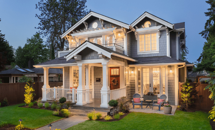
This is my number one no-no as a color consultant so please don’t pick your colors from the “Color” section. Each brand has a different name for these collections, but they are marked by their rich, bold, vibrant colors and these just do not work on the exterior of homes – especially here in Colorado. Most of the homes I work on are covenant controlled which means my client’s needs to receive HOA approval for their colors but even if they don’t need approval, I tend to guide clients towards neutral color families that are better designed for the exterior of a home.
Of course, there are always exceptions to the rule, like when we’re selecting colors for a Victorian or we’re looking for a fun pop of color on the front door but if you are choosing your own colors and want to play it safe then look for neutral colors. The best collections for exteriors are generally labeled as neutrals, historical, and timeless color collections. Stick within those parameters and you’ll narrow down choices and most colors should be relatively safe for the exterior of your home.

Gray Your Colors Down
This doesn’t mean your exterior has to be gray but it’s a good idea to have some gray in your exterior paint colors. Gray undertones help to tone down the saturation of a paint color which in turn makes that color more suitable for use on the exterior of your home. Let’s say you like the idea of a purple home. By adding gray to purple, you get more of a taupe color which is beautiful on a house and nods to purple without being overpowering and in your face. Adding gray to any color can help ground the color and helps ensure your neighbors won’t be talking about you behind your back. No one wants to be that house.
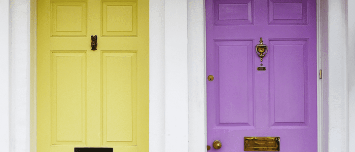
Pair Bold Colors with a Neutral
If your heart is set on a bolder color option for your exterior, then a great way to achieve a harmonious color scheme is to pair your bold color with a neutral. When you have too many bold colors in one space it can feel like they are competing for attention and could end up being overwhelming to the eye. By pairing a bolder color with a softer neutral you really let the color shine without feeling too complicated. An example of this would be pairing a deep blue body color with a white trim or a greige body with a deep plum trim. Use your bolder, brighter colors as a pop on your front door but keep your body, trim, and shutters relatively neutral. This will help draw the eye to those more intense colors without making your house feel out of place or cartoony.
If you’re still concerned about choosing the wrong paint colors, then we suggest you work with a professional color consultant to find the right paint colors for your home. Just remember to stay open to the possibilities and take the advice of professionals when they caution you that a scheme might be too busy or vibrant. We’ve seen the good, the bad, and the truly ugly so we do our best to guide you in the right direction.